It's been a little quiet around here lately and if you've been following our Facebook page, you may have seen a few sneak peeks from some photo shoots that we did while we were traveling in Paris last week. Being a wedding photographer means that we often work and live on different hours than traditional jobs. We work almost every weekend during wedding season and can pick up and leave work whenever we'd like since we work at home, which means odd hours and some times with too much to do and others with not enough to do (although we wish there was more time like that!). While students and teachers get summer vacations, we're at our busiest shooting weddings on weekends and editing like machines during the week. This also means that our vacation schedule is slightly different than most, so we took advantage of some inexpensive airfare last week and jetted off to our favorite destination, Paris! We had an amazing time walking around the city, eating great food and taking in the culture. We worked a little while we were gone as well, which we're excited to show you in the coming weeks. But for now, we're back at work and excited to show you another one of our off-season projects - new sample albums! I'll start by saying that I am a very picky shopper. Put me in a store with no price tags and I'll automatically choose the most expensive item. I have a keen eye for handmade, high quality products (call it a blessing or call it a curse to the wallet!) which is why it's taken us so long to find the right album companies to incorporate into our business. We wanted something that looked and felt really nice. We wanted something that could stand the test of time in design and quality. We wanted something that highlighted the images and showcased them in a beautiful way. We wanted a visual journal that would become an heirloom in our client's lives.
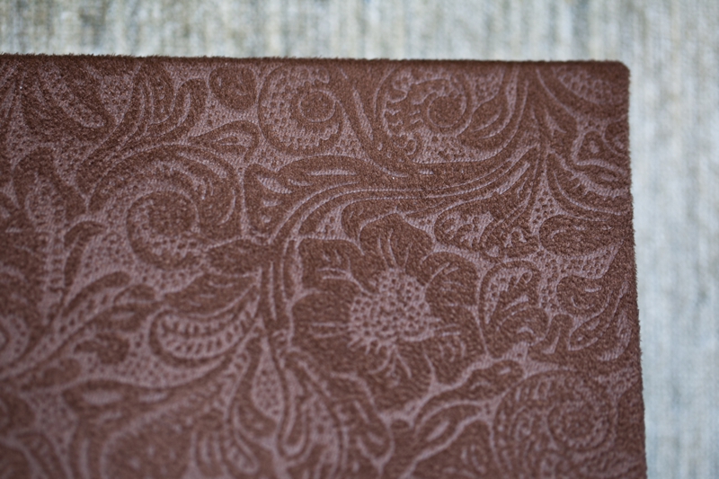
We found three little beauties that we're very excited to offer this year. First off, we'll show you the Standard Album. It's an 8x8 inch layflat album, which means that the pages lay 180 degrees when it is opened. There are dozens of leather cover choices, but for our sample we decided to pick the odd duckling cover choice, a subtle, floral brown velvet.
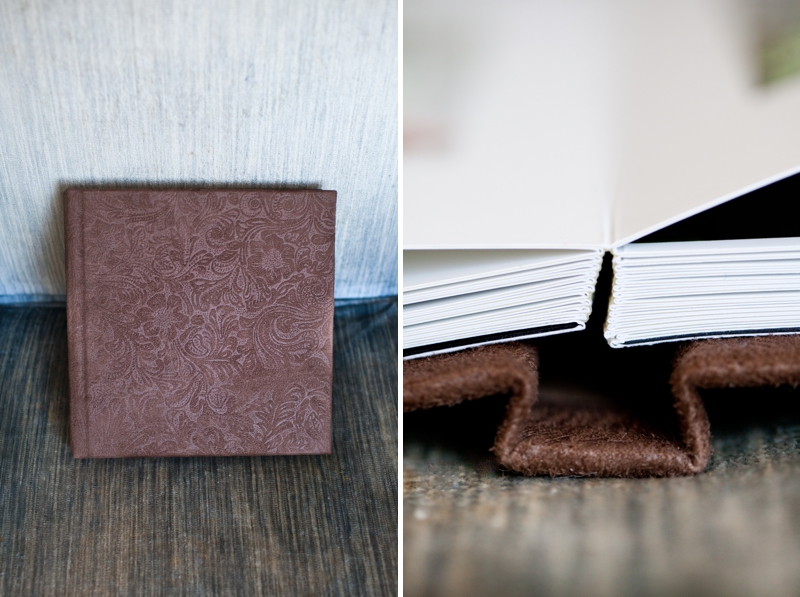
You can see the binding has folded pages, meaning there is no break between them. This allows you to print a large composite image across two pages if you wish.
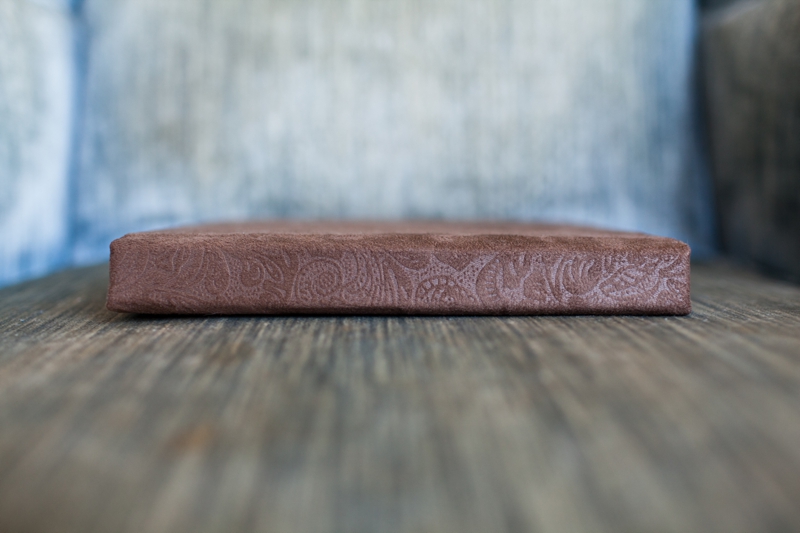
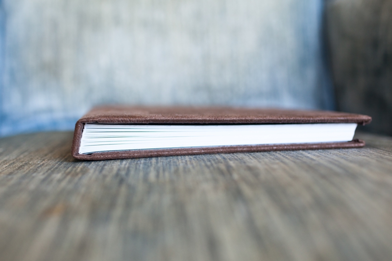
The Standard album is a popular choice for Parent Albums since it is smaller, lighter and cost effective.

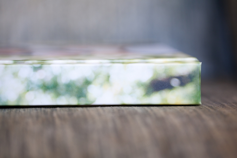
The next album we're offering is what we call our Portrait Album. It's 10x10 and is a layflat album, similar to our Standard Album. Again, this means the pages open to 180 degrees when opened. You get to choose your own photo for the cover, and your own text as well (if you want it). It's heavier than our Standard album but you can easily handle it with one hand. The pages are slightly thicker than the Standard.

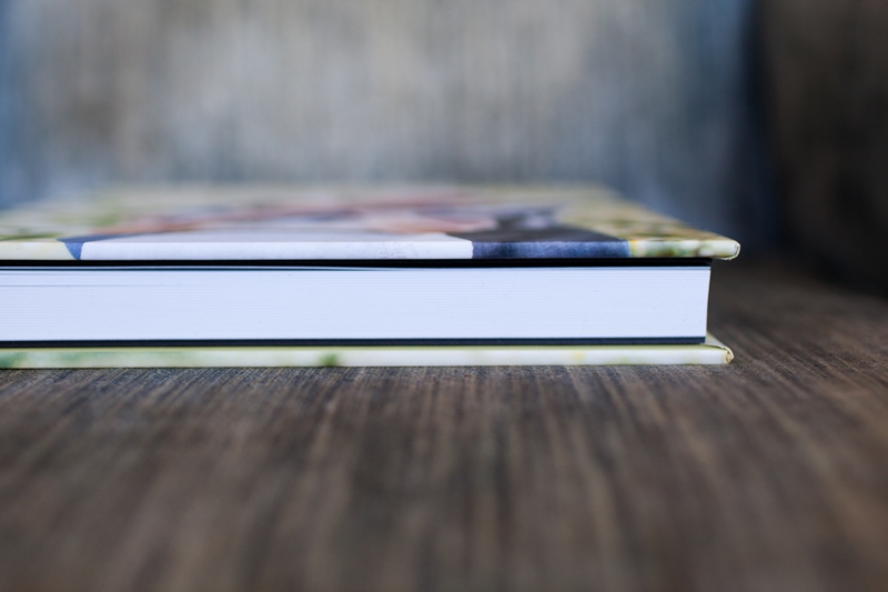
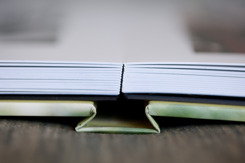
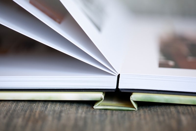
Nice thick pages! We love this album.
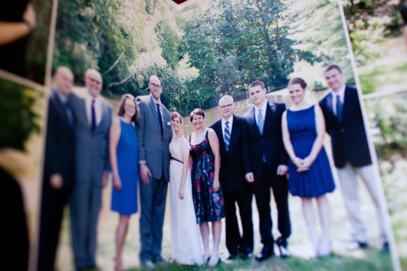
Here's an example of one image printed on the seam. In the above photo, we're holding two pages at a V angle so you can see where the seam is. In the photo below, the book is laid flat.
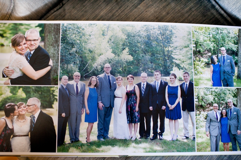
Where's the seam!? It disappeared.

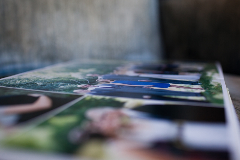
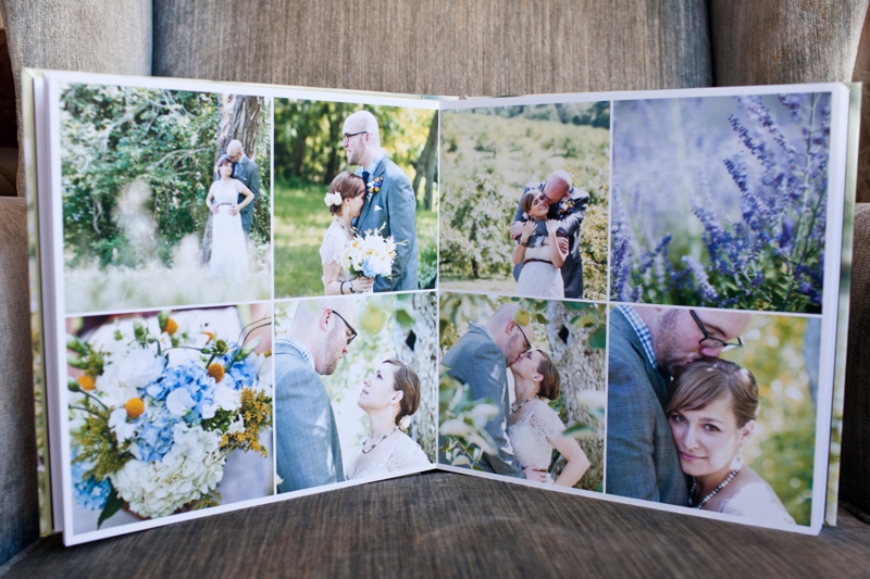
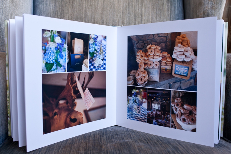
We do all of the album designing and ordering. We try to keep the designs clean and aesthetically pleasing. It's always good to incorporate detail images into albums so you can get a three dimensional perspective of the wedding. You might not print out and hang a photo of your donuts display in your house, but it adds so much to an album.
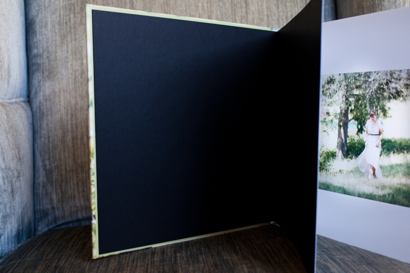
The front and back of the book start and end with black end paper.
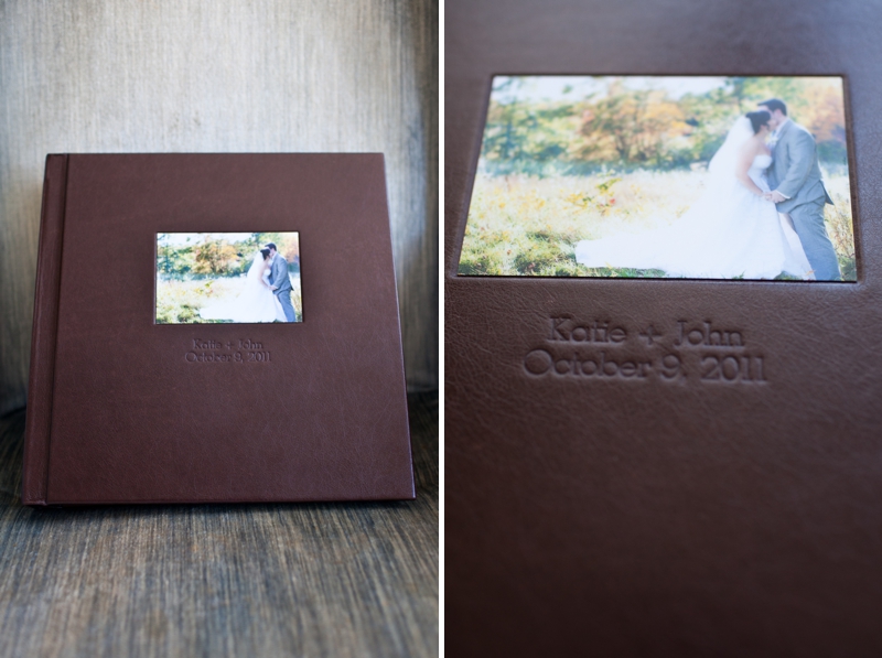
And finally we introduce our Leather Album! This is the creme de la creme of wedding albums at 12x12 inches an almost nine pounds! It is also a layflat album, but it has split pages so the crease between the pages will never ever wear out. You can customize text imprinting on the front and on the spine if you wish. You can put a matte image plate on the front cover (in many different areas). There are dozens of top grain, premium and vegan leather options available. I literally said, 'ooooooh!' when I held this album for the first time. It is PREMIUM.
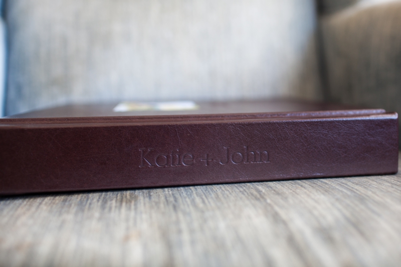
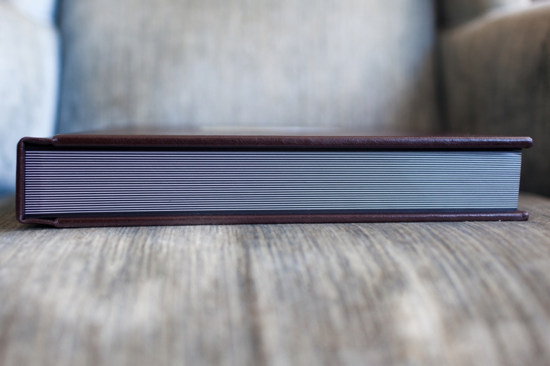
Warning, you might need to do some bicep curls before handling this album. It's 50 thick pages of album goodness.
And look! A little secret branding mark from us on the inside cover so you'll subtle remember who took your photographs 50 years from now.
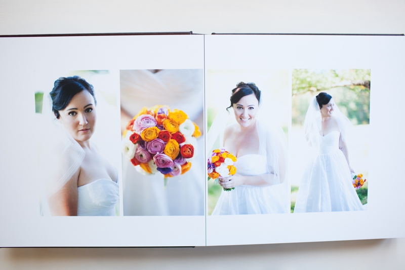
Yep, it was so big when open (24 inches across in fact) that our wide angle lens couldn't fit it all in.
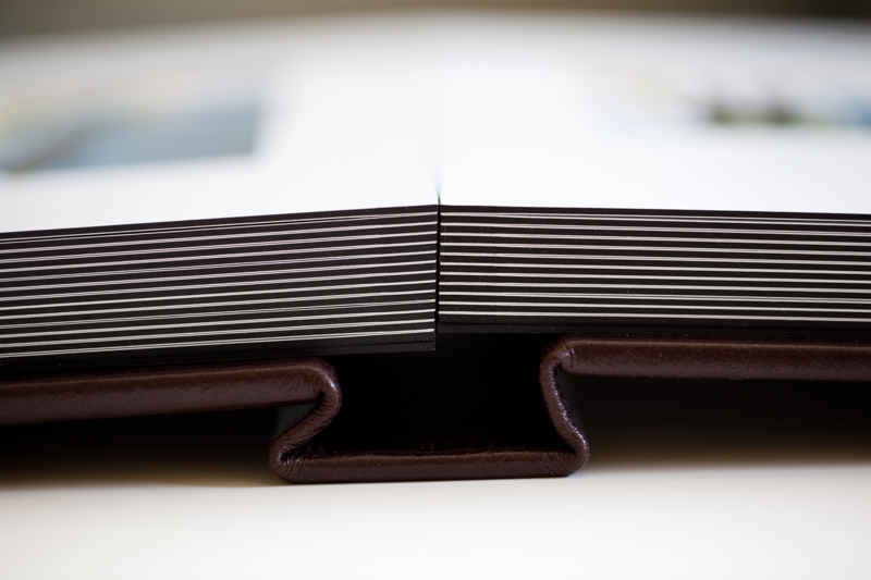
Gorgeous binding I tell you. Gorgeous.


Look at those thick pages!
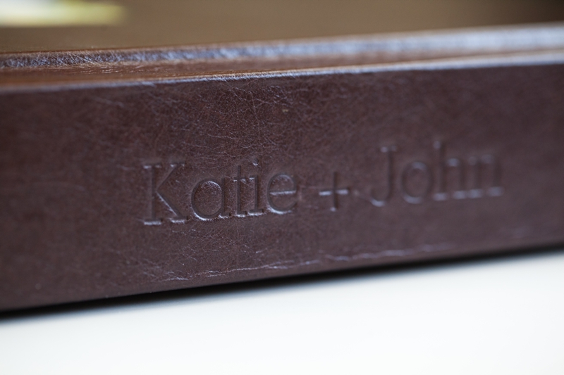
Close up of the spine imprinting, which we choose the couple's name for this album. A Wedding Date might also be sweet.

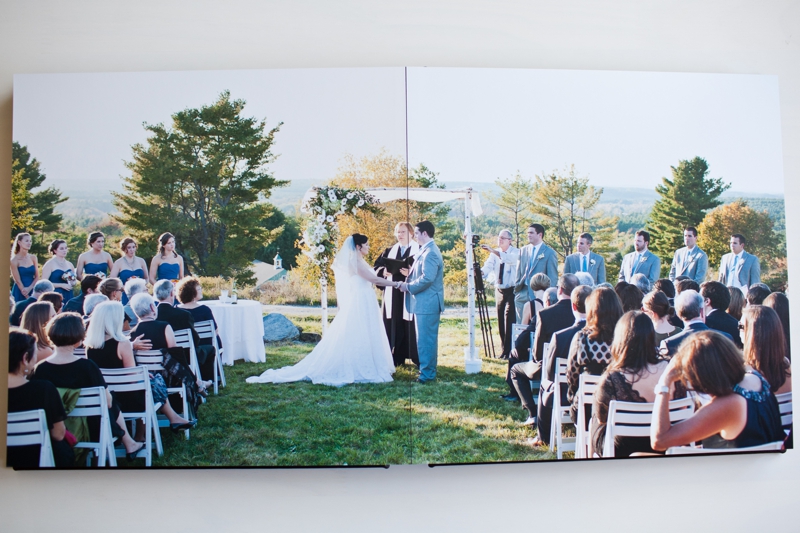
On the left and below, one large ceremony image spread across two pages. On the right, a close up of the image plate on the cover. Keep in mind that we used a lens that would focus on the corner of this so the image is a little blurry on purpose. In real life it's very clear.
And there you have it! Our three new additions to Summer Street. We're very excited to be offering such exquisite products and hope many of our clients take advantage of them. For those of you who need a little convincing that an album is a good idea, think back 15 years ago when you inserted a floppy disk into a computer to look at documents. You'd be hard pressed to find a floppy disk in any modern computer today. We do our best to keep up with the latest technology (like delivering our wedding images on adorable custom USB drives that are more sturdy than a disk) but as we all know technology moves faster than the speed of light these days, so having a tangible book of your photos is without a doubt the best way to preserve the memory of your wedding day.
Connect with us if you'd like more information about prices, number of pages, cover options or to set up a time to come see our samples in person. Happy First Day of Spring!
